More news
- Axalta releases Q1 2024 results
- PPG again earns EcoVadis gold rating for sustainability practices, ranking among top 7% of...
- Baikowski® France 2030 plan winner for its innovative project to decarbonise alumina prod...
- New CEO at BASF: Martin Brudermüller hands over to Markus Kamieth
- Wacker stays below prior-year figures amid lower selling prices in Q1

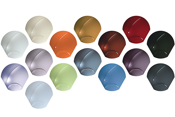
Designers for BASF’s Coatings division have delved into new colour spaces for the 2021-2022 Automotive Color Trends collection. Borrowing a phenomenon from quantum mechanics, this year’s collection is called SUPERPOSITION, which is a state where the limitation of binary systems is overcome.
In other words, things aren’t just black or white, heads or tails, one or zero. The world has an uncountable number of variations, and this collection immerses itself in those variations. The colours benefit from an unlimited vocabulary of design, which can be playful and serious, comfortable and disturbing, or clear and chaotic all at the same time.
EMEA – Eye-opening and thought-provoking colours
ColoUrs designed for Europe, Middle East, and Africa (EMEA) use familiar coloUr positions, but change them with the help of new effects, subtle colour gradients, or a specific sparkle behaviour. Shades of grey change their colourfulness according to the angle of view. Shades of blue are light, reflective and structure the surface.
"These eye-opening and thought-provoking colours are a superposition of complex tones that challenge our perception,” said Mark Gutjahr, Head of Automotive Color Design, EMEA.
Asia Pacific – recharge and think ahead
Asia Pacific saw societal change as its biggest trend for 2021. Many used the time they had to recharge, think ahead, and build energy for the future. Out of a uniformity in thoughts, products and materials of the past came flexibility and freedom. Everybody and everything should be accepted – not only people, but also products and materials. Everything can be flexible.
"Asia Pacific’s key coloUrs are light, clean shades evoking the exciting look of spring and the forward-looking hope it brings,” said Chiharu Matsuhara, Head of Automotive Design for Asia Pacific. "They show a higher level of understanding of our diverse world.”
North America – the concept of balance
North America’s future colour designs looked to the concept of balance that strikes a chord with human steadfastness. The colour spaces are anchored in optimism and resilience, and show the potential for humanity to move forward despite the challenges.
"We found the equilibrium between the natural and the synthetic world to create calming, unwavering, and thought-provoking colours. They draw the viewer into unique sensations that operate on multiple non-binary levels,” said Paul Czornij, Head of Automotive Design for the Americas.
Colour Expertise of the Coatings division
Every year, the designers of BASF’s Coatings division study future trends which they use as foundation for the development of surface, texture and coloUr positions. They draw inspiration from industry, fashion, consumer products, nature, and more. This research is shared with BASF’s customers, the automotive designers, to drive future mass production plans.


