

More news
- Focus on industrial: Powering the energy industry during extreme heat
- Focus on powder coatings: The coatings industry’s transition to PFAS/PTFE-free solut...
- “We see sustainability as a purpose, as a reason for doing business” – P...
- Focus on industrial: High-performance coating protects tanks at biopolymer production plan...
- Focus on powder coatings: Novel high-speed crosslinking technology
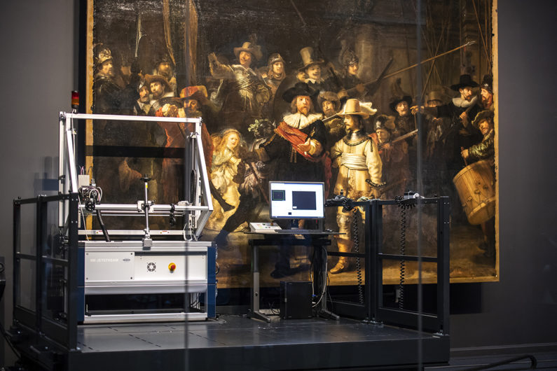
As part of AkzoNobel’s Operation Night Watch partnership with the Rijksmuseum in Amsterdam, the two are venturing into the shadows and working together, to develop a colour calibration method which will produce more accurate digital results when photographing 17th century Dutch paintings
It’s arguably one of life’s most frequently debated questions when discussing paint choices: is black a colour? You won’t be surprised to learn that the reply isn’t exactly straightforward.
It’s fair to say that the answer may at first seem to be a firm no. Why? Because according to physics, black surfaces absorb nearly all wavelengths of light, resulting in an almost complete absence of visible light.
But seeing very little light does not in itself automatically make something black and colourless, a bit like when you look at a wall in the evening after you’ve switched off all the lights. As long as it’s not pitch black, even at very low light levels, our eyes are still capable of distinguishing lighter surfaces from those with darker tones.
So the best answer to the previous paint-based question is that black is a colour after all. It’s the term we use for surfaces that reflect relatively little light, when compared with other surfaces.
Despite this relative inability to reflect light, black remains an extremely popular design choice – at one time it was famously the only shade available if you wanted to buy a car – and it retains an alluring affinity with all things cool and mysterious.
In fact, delve back into cultural history and you’ll quickly notice that black paint, in all its complex glory, was liberally applied to canvas in the 17th century, most notably by an array of acclaimed Dutch Masters. If you study art from the period, it typically features large areas filled with various darker shades. A classic example is Rembrandt’s The Night Watch, with the top half of the painting in particular being dominated by dark, shadowy tones. Which creates a bit of a challenge.
Digital frontrunner
You see, the Rijksmuseum in Amsterdam (home of The Night Watch) has established itself as a frontrunner in the way it approaches the digitisation of its vast art collection (all its paintings are freely available as high resolution images for download). These images are created by the Rijksmuseum’s own team of photographers, including Henni van Beek and Carola van Wijk – along with data scientist Rob Erdmann – who use a highly technical process far removed from point and shoot.
However, the one challenge that keeps rearing its head is how to accurately capture the colours in its paintings, especially in those notoriously tricky darker areas. It’s a daunting task, which is further complicated by critical factors such as lighting and varnish quality. No surprise, then, that the Rijksmuseum photographers are excited by the prospect of finding improved ways of capturing black areas in old masters.
That’s where we come in. As part of our Operation Night Watch partnership with the Rijksmuseum, we’re working together to develop a colour calibration method which will produce more accurate digital results when photographing 17th century Dutch paintings. It’s one of three innovation projects that have been identified as part of our three-year collaboration, which was launched in 2019.
“By combining the expertise of our colour scientists with the know-how of the Rijksmuseum photographers, we’re aiming to design a tailor-made colour calibration solution,” explains Eric Kirchner, AkzoNobel’s Senior Color Scientist. “We basically want to improve the process the museum uses for making the images. In particular, it will enable them to enhance the capture of darker shades in all future photography, whether they’re dealing with Rembrandt’s artworks or paintings by other 17th century masters.”
Popular choice
Eric adds that four centuries after Rembrandt created his most famous masterpiece, black remains a popular choice for various paint applications, certainly more than you might intuitively expect. “While it’s perhaps less of a popular choice for living rooms, in the world of architecture, black shades make up around 20% of all powder coatings,” he explains. “A quick look at the average street will also reveal that it’s roughly the same percentage when it comes to car colours.”
This is of particular relevance to AkzoNobel, because as a leading global supplier of paints and coatings, creating exactly the right shade of black for our customers is vital. “We need to be able to measure colour extremely accurately,” continues Eric. “Black especially is more difficult because these coatings reflect very little light, so even small measurement errors may lead to issues in paint production.
“For the same reason, small differences in the glossiness of black paints may have a relatively large effect on the measured colour, and they can also lead to visual colour deviations. So we use advanced colour science and push the boundaries of digital technology and measuring techniques to help us generate colours that are as accurate as possible.”
AkzoNobel was actually the first paints and coatings company to introduce a patent on a method for accurate colour measuring using a camera with the help of a set of colour calibration cards. So the company is well placed to help the Rijksmuseum solve the enduring mysteries of the darkest shade in the palette.
Adds AkzoNobel colour researcher, Tammo Koster, who is part of the project team: “Black has held a special interest for our color experts for many years – and it will no doubt continue to do so.”