

More news
- Ask Joe Powder – October 2024
- Chinese paint majors look to domestic consumer sales as commercial real estate slumps
- Architectural coatings in Nepal and Bhutan
- A wild ride for U.S. construction and housing: Coatings and adhesives opportunities in 202...
- Levant paint industry and market marred by armed conflict and civil turmoil
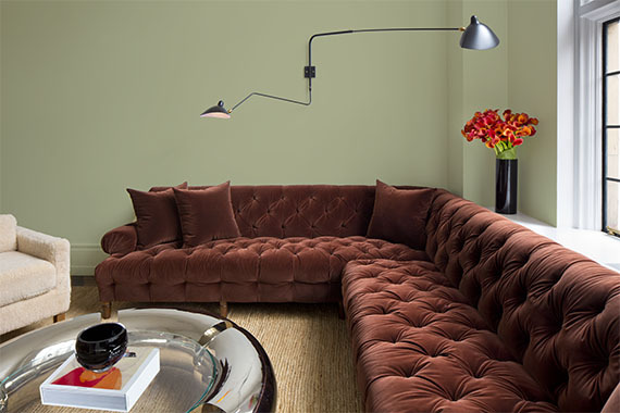
After a year of stay-at-home orders and too few IRL (in-real-life) moments in 2020, homeowners, designers, architects and facility managers are craving authenticity, nature and meaningful human interaction after living in a mostly digital world. Today, PPG introduced its 2022 Color of the Year: Olive Sprig (PPG1125-4) – an elegant, grounded, versatile and highly-adaptable grey-green, this colour represents regrowth in a post-pandemic world, mimicking nature’s resiliency.
Olive Sprig is a relaxed, but enticing green that emulates the feeling of soothing aloe vera or a fragrant plant – brightening any space with organic liveliness. A versatile colour that lives well inside or outside, Olive Sprig blends in with nearly any environment.
"As many of us know following a year of lockdown, the easiest way to shift your mindset is to change your environment. While we begin to trade sweatpants for strappy shoes, recipes for reservations, and a night in for a night out, our paint colour preferences are shifting too, in both residential and commercial spaces,” said Amy Donato, Senior Color Marketing Manager, PPG paint. "DIYers, property managers, designers and architects are shifting away from the stark, neutral palettes of yesterday and opting for colour in all forms. Call it rebellion, but we are certainly here for the resurgence of optimistic colours to guide us into a new era of home design.”
Lending itself to be paired with natural materials, Olive Sprig looks beautiful alongside unique architectural elements and furniture with curved forms to create a comfortable and grounded space. The colour can help create a sanctuary in a bedroom, encourage focus in an office, offer the perfect neutral backdrop in a retail or restaurant, and create a grounded getaway in hotels. Olive Sprig also pairs beautifully with brass accents and wood tones on an island or lower kitchen cabinets. Homeowners, designers, architects, and other customers of professional painters can also gather inspiration from this colour through the use of floor-to-ceiling emerald tiles in a bathroom, incorporating a luxe velvet green couch in the living room, or immersing the home in plants in a variety of shapes, colours and sizes.
In addition, after the rise of working from home and remote learning, homeowners have shifted away from open concept living spaces to individual rooms in order to create privacy and compartmentalise working life from personal. For those in need of a little more separation, painting a wall or nook a different colour from the rest of the room is a simple, affordable project that can instantly transform a space and help create boundaries in your home that will change and adapt as our lives do.
As part of PPG’s annual Global Color Forecasting Workshop, the company’s experts uncovered that consumers are more inclined to adopt more colourful selections after difficult inflection points throughout history, often seen during the Roaring Twenties or after the Great Depression. As part of this cyclical history, PPG is seeing post-pandemic optimism infiltrating commercial and residential design spaces so many can create a sense of escapism. Just as trends in the 1920s were marked by opulence, metallics, rich woods, layers, moody colours and angular shapes, today’s home décor is drawing inspiration from the Antiquity, Baroque and Renaissance eras of art, sculpture and architectural forms. This colourful embrace is thought to reflect an optimistic rebellion, a sign of personal expression or soothing self-care.
Resilience, the need for connection and inspiration from nature were recurring themes at PPG’s Global Color Forecasting Workshop. This annual event brings together more than 30 PPG global colour stylists from the automotive, consumer electronics, aerospace, and home paint and stain industries. Over the course of several days, the stylists analyse the runway, lifestyles, demographics, geographies, global events and cross-cultural societal inspirations to determine what colorus will resonate and represent the PPG global colour forecast, including the PPG 2022 Color of the Year.
Under the theme Horizon, which represents our current state of hope, reflection and new beginnings in the post-pandemic era, PPG’s colour experts identified three colour stories that will resonate for homeowners, designers, architects, and facility and property maintenance managers in 2022:
Invaluable: The Invaluable palette culminates a rich library of cultural references to imagine its perfect place in today’s world. Drawing Gatsby-esque inspiration from the past to create the go-to glamorous palette of the present, this colour story is not afraid to be bold. Grounded with rich hues like PPG’s Gooseberry, Castle Stone and Ancient Copper, the Invaluable palette adds depth and warmth to any space. Pair these colours with rich, dark woods and brass accents to really turn up the drama – especially in the home, restaurants or hotels.
Introspective: The Introspective colour story is for those that prioritise self-care and appreciate life’s simple pleasures. Create a serene and intimate space with colours like PPG’s Tea Time, Peace, Silver Service and Pine Whisper, which complement the soothing comfort of Olive Sprig. These hues are perfect for the private yet soulful consumer looking to create an ethereal bedroom retreat, a thoughtful office space, or add a hint of colour to an otherwise neutral-toned kitchen.
Inspired: Those drawn to the Inspired colour palette cannot be pinned down! These mood-boosting shades are sure to turn up the volume in any space and add an optimistic jolt of energy for spaces that need it most – like a statement-making front door, a unique retail environment, or an inspiring child’s playroom. PPG’s Cenote, Aloha and Lettuce Alone offer liveliness and mimic high-tech greens and blues that are sure to turn heads. Warm hues like Paris Pink, Coral Silk and Crushed Pineapple are perfect picks for the confident, social and adventurous painter who wants to spread joy, embrace change, and break free from minimalist designs of years past. PPG’s Olive Sprig acts as a muted neutral in this palette to ground the bolder, brighter colour counterparts.